

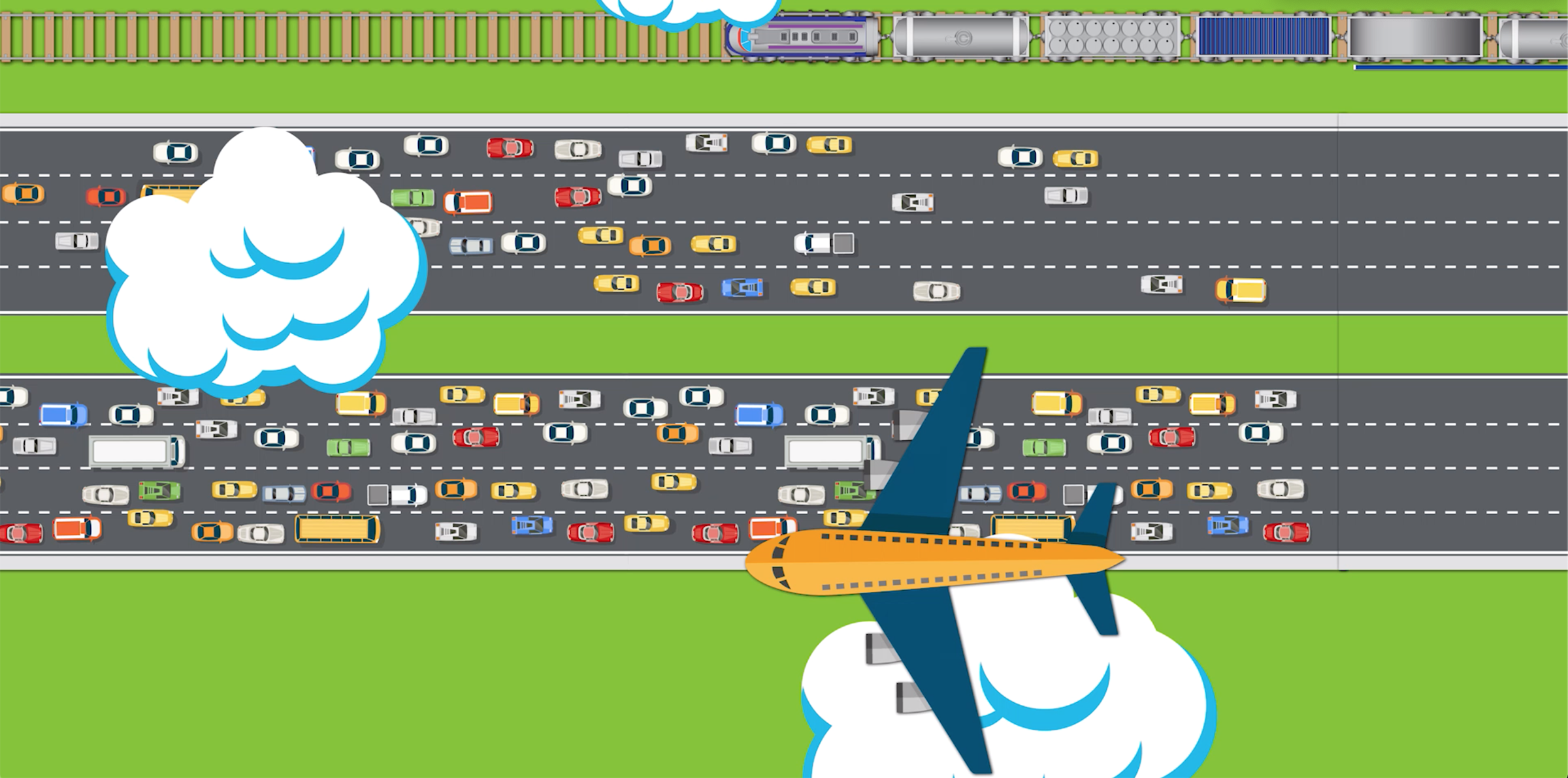
The National Transportation noise map is a great way to explore how noise pollution affects communities nationwide. Created by the U.S Bureau of Transportation Statistics, this mapping project takes data from the Federal Highway Administration and the Federal Aviation Administration and uses it to illustrate the different noise levels within the United States. Keep in mind that this map only displays data for transportation driven noise pollution! So it doesn’t account for noise pollution created by industrial buildings, construction, or sports/concert venues.
Big cities, specifically near highways and airports, are on average the loudest locations in the nation!
One of the reasons this map is so helpful is because it can be used to alert us to areas with high noise pollution coming from transportation. Parts of the map that are red, purple, and blue show areas with noise levels over 65 decibels, which with extended exposure may lead to increased health risks.
The more we know about which areas are suffering the most from transportation induced noise pollution, the better we can concentrate on advocating and helping these areas! Click the link below to explore the map yourself and find out how your community is affected by noise pollution.
https://maps.bts.dot.gov/arcgis/apps/webappviewer/index.html?id=a303ff5924c9474790464cc0e9d5c9fb


